7 Top Operations Dashboard Examples & Templates to Use in 2026
Discover 7 powerful operations dashboard examples and templates. See how tools like FlyDash and Grafana can help you monitor KPIs and streamline workflows.
By Parth
1st Feb 2026
Last updated: 1st Feb 2026

An operations dashboard is more than just a collection of charts and graphs; it’s the central command center for your business. It transforms raw operational data into a clear, real-time view of performance, enabling teams to monitor, diagnose, and optimize critical processes across the organization. Without this unified perspective, teams are often left navigating data silos, reacting to problems instead of proactively preventing them.
A well-designed dashboard provides the crucial visibility needed to manage everything from supply chain logistics and financial operations to application performance and incident response. The challenge isn't a lack of data, but a lack of clarity. A great operations dashboard cuts through the noise, surfaces the most important KPIs, and empowers teams to make faster, more informed decisions. The right layout can immediately flag a bottleneck in your delivery network or pinpoint a server issue before it cascades into a full-blown outage.
This guide moves beyond theory to provide a curated collection of actionable operations dashboard examples. We will analyze real-world dashboards built on platforms like FlyDash, Tableau, and Grafana, breaking down the strategic thinking behind their design. For each example, you’ll find:
- Strategic Analysis: Why the layout works and the problems it solves.
- Key Metrics: A breakdown of the essential KPIs being tracked.
- Actionable Takeaways: Replicable strategies and quick implementation notes to help you build a similar dashboard for your own team.
Our goal is to give you the specific insights and practical templates you need to build a dashboard that provides genuine operational leverage, moving your team from reactive problem-solving to proactive, data-driven management. Let's explore the examples.
1. FlyDash
FlyDash represents a significant leap forward in creating bespoke internal tools, positioning itself as a premier choice for teams needing powerful, custom operations dashboard examples without the traditional development overhead. It's an AI-first builder that translates simple plain-English prompts or even sketches into fully functional applications, complete with a frontend, backend, and database. This innovative approach empowers non-technical users like operations leads and product managers to rapidly prototype and deploy the exact tools they need, while still providing developers with the control and flexibility of production-grade code.
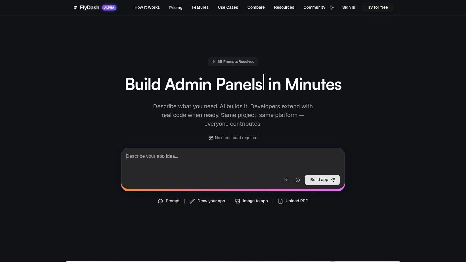
Unlike template-based builders that often impose rigid structures, FlyDash offers unparalleled flexibility. It generates clean, exportable React Native/Expo code, effectively eliminating vendor lock-in. This hybrid model allows a business analyst to build a functional V1 dashboard in minutes, which an engineering team can then refine, extend with custom logic, and deploy to production infrastructure using standard development practices.
Core Strengths and Strategic Advantages
FlyDash excels in three key areas: speed, collaboration, and extensibility. The platform's AI-driven generation dramatically shortens the build-test-iterate cycle, turning a process that once took weeks into a matter of hours.
- AI-Powered Scaffolding: Generate entire full-stack applications from a simple description. For instance, a prompt like, "Create an operations dashboard to track order fulfillment status from our Shopify API, showing KPIs like 'orders pending,' 'average fulfillment time,' and a table of late orders with customer details," can produce a working application baseline.
- Real-Time Collaborative Environment: The platform functions like a Google Doc or Figma for app development. Business and technical teams can work together in a shared workspace with live cursors and instant syncing, ensuring the final tool precisely meets operational requirements.
- No-Code to Pro-Code Pipeline: It uniquely bridges the gap between no-code simplicity and professional development. Users can connect to live data sources (SQL databases, REST APIs, GraphQL) and, when needed, open a code editor to add complex logic or integrate with a Git repository for version control.
Building Your Operations Dashboard with FlyDash
FlyDash is particularly well-suited for a variety of operations dashboards, including logistics tracking, financial operations monitoring, and incident response coordination. The ability to connect directly to production data sources means your dashboard provides a real-time, actionable view of business health.
For example, to build a financial operations dashboard, a finance lead could start with a prompt specifying key metrics like Accounts Receivable aging, daily transaction volume, and burn rate, connecting directly to Stripe or a financial database. The AI would generate the initial layout and data visualizations, which could then be collaboratively refined.
Pricing and Availability
FlyDash operates on a freemium model, making it accessible for individuals and small teams to start building immediately.
- Freemium: $0/month, includes 5 daily AI credits (up to 20/month). Ideal for evaluation and small projects.
- Starter: $20/month, provides 50 monthly AI credits.
- Pro: $49/month, offers 150 monthly AI credits for more intensive use.
- Enterprise: Custom pricing for dedicated infrastructure, white-labeling, and advanced compliance needs.
Annual plans offer significant savings (up to 50%), and promotional codes are occasionally available. While the platform is currently in an alpha stage, its rapid development and unique value proposition make it a compelling solution for teams looking to build powerful, custom operational tools with exceptional speed and flexibility.
Website: https://flydash.io
2. Tableau Viz Gallery (Tableau Public)
For those looking to move beyond static images and study the anatomy of truly interactive operations dashboards, the Tableau Viz Gallery is an essential resource. It's a massive, curated library of public visualizations built by the Tableau community, offering a deep well of inspiration for layout patterns, KPI storytelling, and complex data interaction. Unlike a simple template library, the gallery provides real, working examples you can dissect.
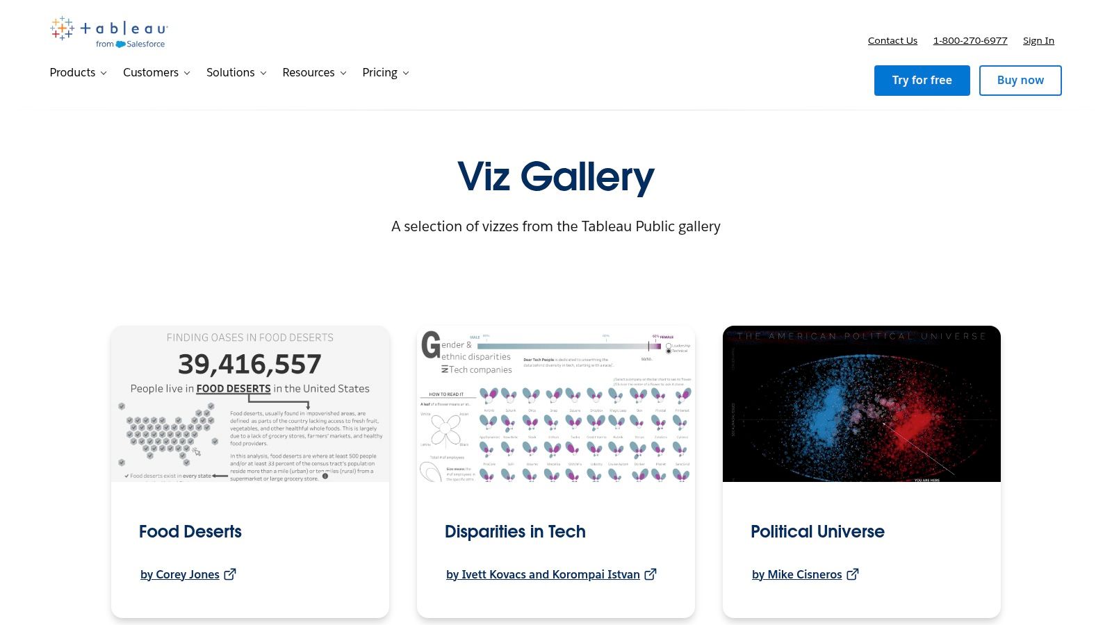
This platform stands out by showcasing the art of the possible in data visualization. You can explore how others have solved common operational challenges, such as tracking supply chain logistics, monitoring incident response times, or visualizing financial performance across departments. Many visualizations are downloadable, allowing you to reverse-engineer complex designs in Tableau Desktop or Cloud.
Strategic Analysis & Key Features
The primary value of the Viz Gallery lies in its depth and quality. The "Viz of the Day" feature highlights exceptional designs, ensuring a constant stream of fresh, high-quality inspiration. This is invaluable for operations managers and analysts looking to benchmark their own dashboard designs against best-in-class examples.
- Key Metrics Displayed: Varies widely, but common examples include order fulfillment rates, mean time to resolution (MTTR), on-time delivery percentages, customer satisfaction (CSAT) scores, and inventory turnover.
- Layout Rationale: Many dashboards adopt a top-down approach, placing high-level KPIs at the top, followed by more granular charts and tables that users can explore with filters and drill-downs.
- Interactive Elements: The gallery excels at demonstrating advanced interactivity. Look for examples with dynamic date range filters, clickable map regions that update other charts, and parameter controls that let users switch between different metrics on the fly.
Actionable Takeaway: Use the search function with terms like "logistics," "supply chain," "operations," or "incident report" to find relevant operations dashboard examples. Don't just look at the visuals; interact with every filter and clickable element to understand how the creator guides the user's analytical journey.
Practical Tips for Use
While the gallery is free to browse, fully leveraging its content requires the Tableau ecosystem. Tableau Public is a free tool for building and sharing visualizations, but it has limitations (e.g., all work is public). To connect to private data sources and adapt these designs for internal use, you'll need a paid Tableau Desktop or Cloud license.
Pros & Cons:
| Pros | Cons |
|---|---|
| High-Quality Examples: Huge variety of real, interactive dashboards. | Not Turnkey: These are examples, not one-click templates for your data. |
| Community Curation: "Viz of the Day" ensures you see the best work. | Requires Tableau: Building or editing requires Tableau software (paid/public). |
| Downloadable Workbooks: Many vizzes can be downloaded for reverse-engineering. | Public Content Quirks: Some dashboards may have embedding or browser issues. |
Website: Tableau Viz Gallery
3. Microsoft AppSource (Power BI Template Apps & Dashboards)
For teams embedded in the Microsoft ecosystem, AppSource is the go-to marketplace for deploying prebuilt, data-connected operations dashboards. It serves as an official library of "template apps" for Power BI, which go a step beyond simple visual templates. These are installable packages containing complete reports, data models, and dashboards that you can connect to your own data sources like Azure DevOps, Dynamics 365, or Salesforce.
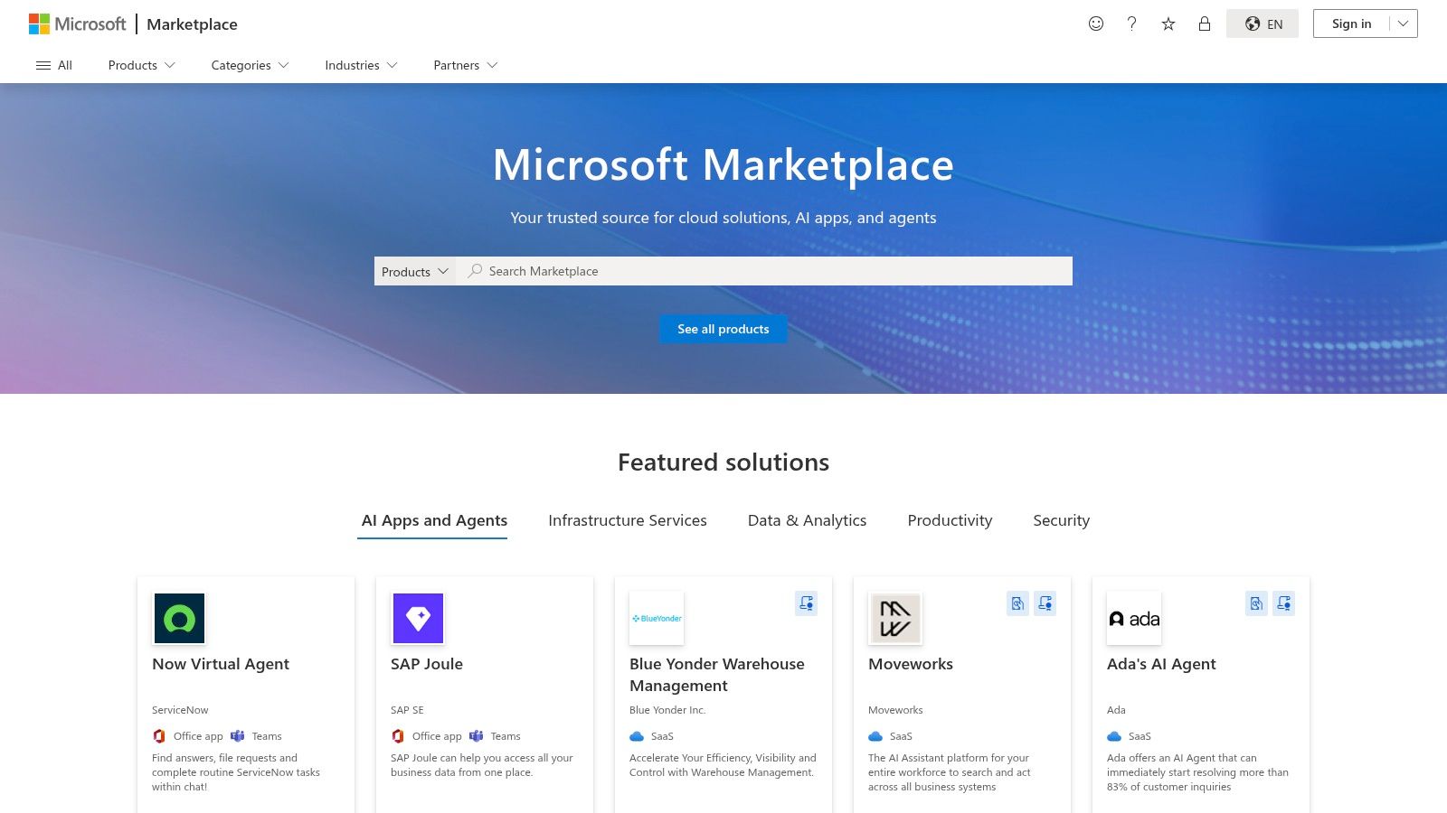
This platform stands out by offering a fast path from concept to a live, functional dashboard. Instead of building from scratch, operations teams can find a template app designed for a specific service (like project management or financial analytics), install it with one click, and follow a guided process to link their live data. This dramatically accelerates the deployment of standardized, governance-friendly operational reporting.
Strategic Analysis & Key Features
The primary value of AppSource is its focus on enterprise-ready, turnkey solutions. Publishers must meet Microsoft's validation criteria, providing a level of trust and security. For operations managers, this means less time spent on dashboard construction and more time on analysis, as the core data models and KPI calculations are often pre-configured.
- Key Metrics Displayed: Varies by app, but templates often focus on specific operational domains. Examples include lead-to-opportunity conversion rates (Dynamics 365 Sales), sprint burndown and cycle time (Azure DevOps), or ticket resolution times (ServiceNow).
- Layout Rationale: Most templates follow a standard executive summary format. A top-level page provides high-level KPIs, with subsequent pages allowing users to drill down into specific dimensions like team performance, product lines, or geographical regions.
- Interactive Elements: Standard Power BI interactivity is built-in. This includes cross-filtering (clicking a bar on one chart filters all others), slicers for date ranges and categories, and drill-through capabilities to navigate from a summary view to detailed, row-level data.
Actionable Takeaway: Use the search filters on AppSource to narrow down by category ("Operations" or "IT") and by data source ("Dynamics 365," "Azure," "Salesforce"). Pay close attention to publisher details, reviews, and update frequency to select a high-quality, well-maintained template for your operations dashboard examples.
Practical Tips for Use
While browsing AppSource is free, deploying and using the template apps requires a Power BI account. Many apps require a Power BI Pro or Premium license to connect to data sources and share the resulting reports with colleagues. The installation process creates a new "App Workspace" in your Power BI tenant, keeping the prebuilt content organized and separate from your other reports.
Pros & Cons:
| Pros | Cons |
|---|---|
| Turnkey Starting Points: Connect to live data sources quickly. | Licensing Required: Full use typically requires Power BI Pro or Premium. |
| Governance-Friendly: Vetted apps with controlled installation. | Quality Varies: The usefulness and design quality can differ by publisher. |
| Clear Publisher Info: Easy to evaluate options with reviews and details. | May Require Payment: Some of the more advanced apps are paid products. |
Website: Microsoft AppSource
4. Looker Studio (Google) Report & Template Gallery
For teams deeply integrated into the Google ecosystem, the Looker Studio (formerly Data Studio) Report Gallery offers a streamlined, fast, and free path to creating functional operations dashboards. It serves as a repository of official and community-built templates that can be copied with a single click, connected to your data sources, and deployed almost instantly. This makes it an ideal starting point for startups and departments needing quick visibility without the overhead of enterprise BI tools.
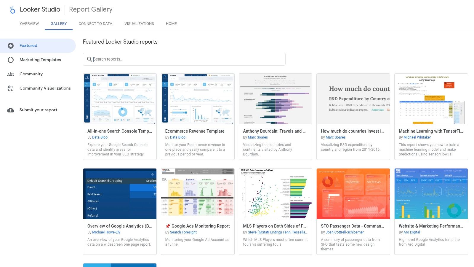
This platform excels at speed and accessibility. Unlike more complex platforms that require significant setup, Looker Studio allows you to go from a blank slate to a live, data-connected dashboard in minutes, especially if your operational data resides in Google Sheets, BigQuery, or Google Analytics. The gallery provides a solid foundation, removing the need to design layouts from scratch and allowing you to focus on adapting the logic to your specific business needs.
Strategic Analysis & Key Features
The primary advantage of the Looker Studio Gallery is its near-frictionless implementation. For operations that track metrics like website uptime via Google Analytics, support tickets in a Google Sheet, or sales performance in BigQuery, these templates offer a direct and efficient solution. They are designed for clarity and ease of use, making them perfect for cross-functional sharing where not everyone is a data analyst.
- Key Metrics Displayed: The gallery includes templates for website performance (sessions, bounce rate), e-commerce sales (revenue, conversion rate), and project management (tasks completed, hours logged). These are easily adaptable for operational metrics like incident counts, ticket response times, or daily production output.
- Layout Rationale: Most templates follow a clean, card-based layout. Key performance indicators are displayed prominently at the top as scorecards, with time-series charts and tables below to show trends and detailed breakdowns. This familiar structure makes the dashboards highly readable.
- Interactive Elements: Standard interactive features include date range controls, drop-down filters for dimensions like region or product category, and clickable chart elements that can filter the entire report page. The focus is on straightforward, user-friendly interaction.
Actionable Takeaway: When browsing the gallery, look for templates with a structure that matches your needs, even if the subject matter is different. A "Website Performance" template, for instance, can be quickly repurposed into a server health operations dashboard by replacing website metrics with server uptime, CPU load, and response time from a Google Sheet.
Practical Tips for Use
The Looker Studio platform is entirely free, requiring only a Google account. The real power comes from its native connectors to other Google products. Before starting, ensure your operational data is cleanly organized in a source like Google Sheets, with clear headers and consistent data types, as this will make the connection process seamless. You can then copy a template, swap the sample data source with your own, and map the fields.
Pros & Cons:
| Pros | Cons |
|---|---|
| Fast & Free: Go from template to live dashboard in minutes at no cost. | Limited for Advanced BI: Lacks the deep data modeling of enterprise tools. |
| Native Google Integration: Seamless connection to Sheets, BigQuery, etc. | Marketing-Centric Templates: Many templates require significant tailoring for ops. |
| Easy Collaboration: Simple to share and embed reports via Google accounts. | Performance Can Lag: Dashboards with very large datasets may load slowly. |
Website: Looker Studio Report Gallery
5. Grafana Dashboards Library (Grafana Labs)
For teams in technical operations, SRE, and DevOps, the Grafana Dashboards Library is the go-to repository for monitoring infrastructure, applications, and network performance. It’s an extensive, community-driven catalog offering thousands of free, importable dashboards. Unlike visual galleries, this platform provides functional JSON files that can be directly imported into a Grafana instance, instantly creating a working dashboard connected to your data sources.
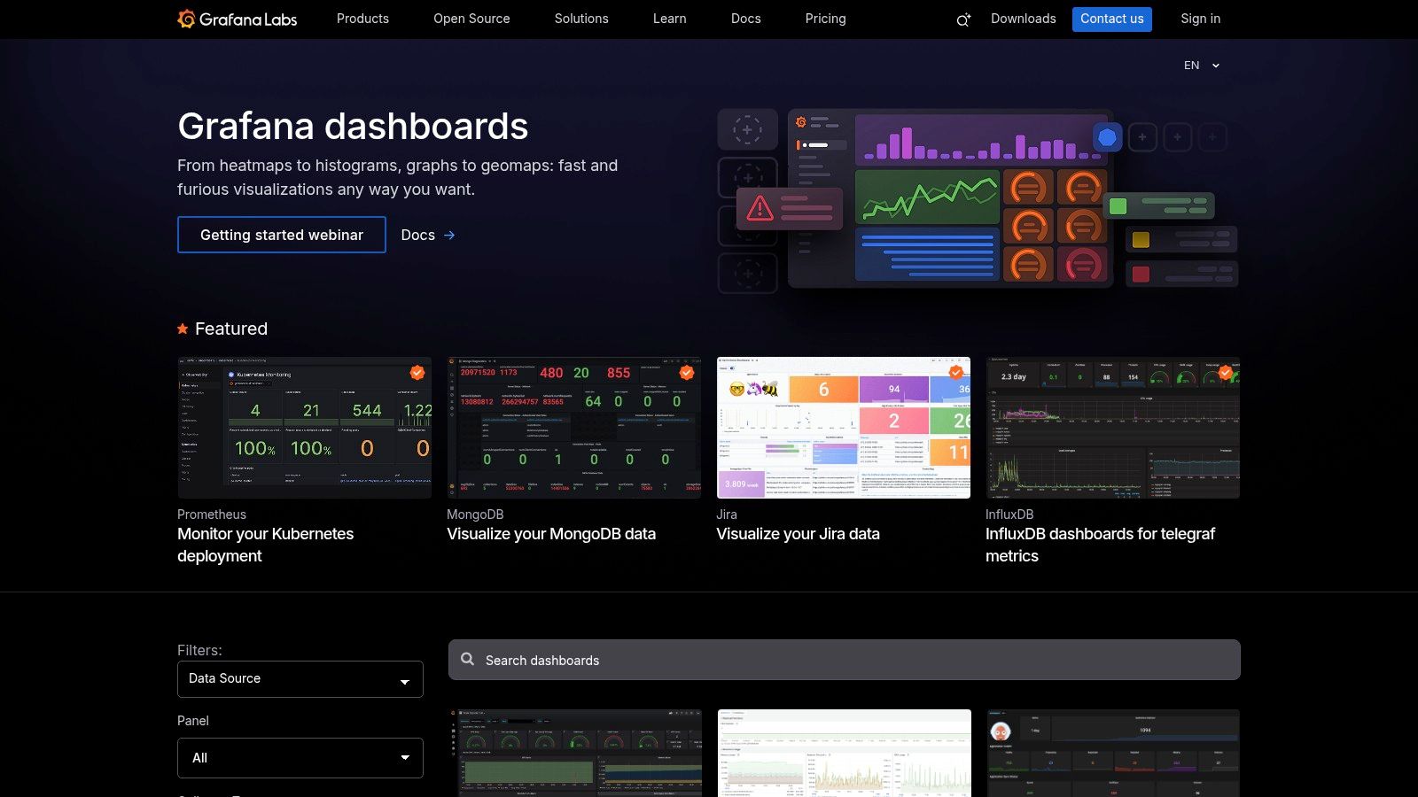
This platform stands out by offering turnkey solutions for monitoring specific technologies. Whether you're running Kubernetes, PostgreSQL, AWS services, or a custom application emitting Prometheus metrics, there is likely a pre-built dashboard available. This significantly accelerates the setup process, allowing operations teams to move from data source configuration to active monitoring in minutes, not hours or days.
Strategic Analysis & Key Features
The library's core value is its tight integration with the Grafana ecosystem and its focus on time-series data, which is critical for modern operations. Instead of starting from scratch, teams can adopt best practices for visualizing metrics from popular tools like Prometheus, Loki, and CloudWatch. The community-curated nature means dashboards are often battle-tested by other engineers facing similar challenges.
- Key Metrics Displayed: Varies by technology but frequently includes CPU/memory utilization, API latency (p95, p99), error rates, request throughput, disk I/O, database query performance, and log volume.
- Layout Rationale: Most dashboards are designed for at-a-glance health checks and deep-dive analysis. They typically feature high-level "stat" panels at the top (e.g., uptime, active alerts), followed by time-series graphs that correlate key performance indicators, and tables for detailed log or trace data at the bottom.
- Interactive Elements: Common features include dynamic template variables for switching between servers, services, or environments. Time range selectors are standard, and many dashboards use drill-down links that navigate from a high-level overview to a more detailed, specific dashboard.
Actionable Takeaway: Before building a dashboard, always search the library first. Use the filters to narrow down by your specific data source (e.g., "Prometheus") and application (e.g., "Kubernetes"). When you import a dashboard, study the underlying queries to understand how experts monitor that particular system.
Practical Tips for Use
The library is completely free to browse and use, with dashboards compatible with both open-source Grafana and the paid Grafana Cloud. The main prerequisite is having the right data sources and plugins configured in your Grafana instance. For example, to use a Prometheus-based dashboard, you must have a Prometheus data source connected and be collecting the specific metrics the dashboard queries.
Pros & Cons:
| Pros | Cons |
|---|---|
| Deep SRE/DevOps Coverage: Thousands of tech-specific dashboards. | Highly Technical: Less friendly for business users without customization. |
| Ready to Import: JSON files provide a one-click import process. | Dependency Issues: May require specific plugin versions or data collectors. |
| Active Community: Constantly updated with new and improved dashboards. | Requires Instrumentation: Useless without the proper metrics being collected. |
Website: Grafana Dashboards Library
6. Databox Dashboard Examples & Template Directory
For operations leaders who need to deploy functional dashboards quickly without extensive development, the Databox Dashboard Examples & Template Directory is a go-to resource. It offers a massive collection of pre-built templates organized by business function, tool, and use case. This makes it an incredibly efficient starting point for teams wanting to visualize KPIs from popular data sources like HubSpot, Google Analytics, or Stripe with minimal setup. Unlike platforms that just offer visual inspiration, Databox provides turnkey templates that connect directly to your data.
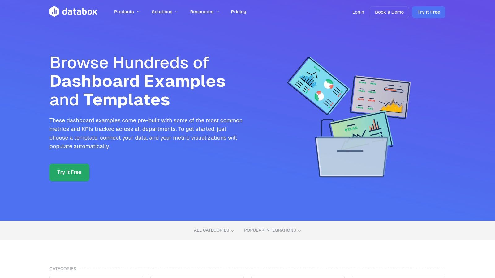
This platform stands out by focusing on speed-to-value. Instead of building from scratch, you can find a relevant template, connect your accounts with a few clicks, and have a live dashboard populated with your own metrics in minutes. The drag-and-drop designer then allows for customization, letting you adjust charts, add branding, and optimize views for mobile devices, making it a powerful tool for teams without dedicated data analysts.
Strategic Analysis & Key Features
The primary value of the Databox directory is its blend of accessibility and comprehensive integration. With over 300 templates, the library covers everything from project management oversight to financial operations and customer support performance. This removes the initial friction of dashboard creation and lets teams focus on analysis rather than configuration.
- Key Metrics Displayed: Templates are pre-configured with common operational metrics like open support tickets, customer lifetime value (LTV), project completion rates, churn rate, and server uptime.
- Layout Rationale: Most templates follow a logical flow, with high-level summary metrics (scorecards) at the top and more detailed trend lines, bar charts, and tables below. The layouts are clean and designed for at-a-glance comprehension.
- Interactive Elements: While simpler than full BI tools, templates include basic interactivity such as date range filtering. The main "interactive" component is the drag-and-drop editor that allows for complete layout customization after a template is selected.
Actionable Takeaway: Use the directory's filtering options to find a template that matches your key software (e.g., Jira, Asana, Salesforce). Install the template with a free account to see how Databox automatically pulls and visualizes your data. This is one of the fastest ways to generate real operations dashboard examples using your company's live information.
Practical Tips for Use
Databox operates on a freemium model. You can get started for free, which allows you to connect a limited number of data sources and create a few dashboards. This is perfect for testing templates and proving their value. To unlock more data source connections, advanced features, and more frequent data refreshes, you will need to upgrade to a paid plan. The hands-on tutorials and help center resources are excellent for guiding non-technical users through the setup process.
Pros & Cons:
| Pros | Cons |
|---|---|
| Quick Time-to-Value: Go from zero to a live dashboard in minutes. | Requires Paid Plan: Some templates and advanced features are behind a paywall. |
| Broad Integration Coverage: Connects to hundreds of popular tools. | Less Flexible for Complex Data: Not ideal for advanced custom data modeling. |
| User-Friendly: Drag-and-drop designer is easy for non-technical teams. | May Be Limiting: Lacks the deep analytical power of a full BI stack. |
Website: Databox Dashboard Examples
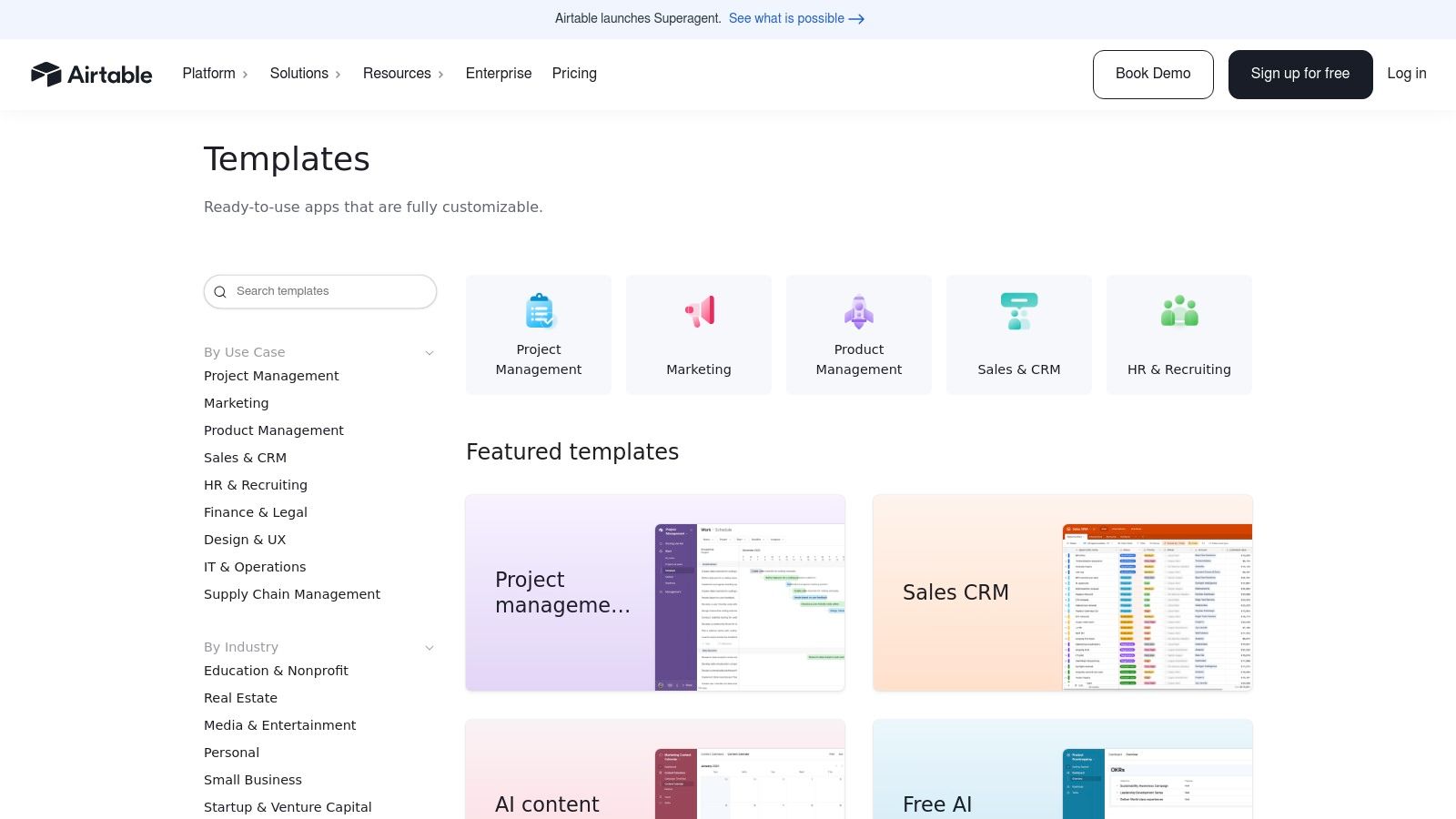
7. Airtable Templates Gallery and Universe
Airtable's strength lies in its unique fusion of a database, spreadsheet, and application builder, making its Template Gallery and community-driven Universe a powerful starting point for operational systems. While not a traditional BI tool, Airtable excels at creating lightweight, interactive dashboards that are deeply integrated with the underlying workflows they monitor, such as content pipelines, product roadmaps, and inventory management.
This platform stands out because it combines data tracking and task management in one place. Instead of pulling data from a separate system, the dashboard often is the system. An Airtable Interface can display charts on project progress that are directly populated by the project management base used by the team, offering a real-time, actionable view of operations that is difficult to achieve with disconnected tools.
Strategic Analysis & Key Features
The primary value of Airtable's templates is speed to implementation for process-heavy operations. You can find a template for almost any business need, from an applicant tracking system to a marketing campaign tracker, and instantly copy it into your workspace. From there, its Interface Designer allows you to drag and drop charts, grids, and numbers to build a custom visual layer on top of your live operational data.
- Key Metrics Displayed: Highly use-case specific. Examples include project completion rates, bug fix velocity, inventory levels by location, content status (e.g., in-draft vs. published), and new lead counts by source.
- Layout Rationale: Airtable Interfaces are modular. Most effective layouts use a mix of "Number" elements for high-level KPIs, bar or line charts for trends, and interactive "Record Picker" lists to allow users to see and edit the underlying data without leaving the dashboard.
- Interactive Elements: Interfaces are inherently interactive. Users can click on a chart segment to see the filtered records that comprise it, update statuses directly from a dashboard view, and use filters that apply to the entire page.
Actionable Takeaway: When exploring the gallery, look for templates that manage a process, not just store data. A good operations dashboard example in Airtable starts with a well-structured base. Use a template like "Project Tracker" or "Inventory Management" as your foundation, then build an Interface on top to create your dashboard.
Practical Tips for Use
Getting started is free and frictionless; you can copy and use most templates on Airtable's free plan. The real power comes from its Interface Designer, which is also available on all plans. For more advanced features like granular permissions, increased automation runs, and sync integrations, a paid plan (Team or Business) will be necessary.
Pros & Cons:
| Pros | Cons |
|---|---|
| Fast to Stand Up: Go from template to a working operational system in minutes. | Needs Customization: You must build the 'dashboard' layer via Interfaces. |
| Actionable Dashboards: Combines data visualization with workflow management. | Limited Analytics: Not as powerful for complex modeling as dedicated BI tools. |
| Large Community Library: Niche and creative templates for nearly any use case. | Advanced Features are Paid: Granular permissions require higher-tier plans. |
Website: Airtable Templates
Top 7 Operations Dashboard Examples — Side-by-Side Comparison
| Tool | Implementation Complexity 🔄 | Resource Requirements ⚡ | Expected Outcomes 📊 | Ideal Use Cases 💡 | Key Advantages ⭐ |
|---|---|---|---|---|---|
| FlyDash | Low → Moderate — AI scaffolds full‑stack; developer review for production | Moderate — monthly AI credits; developer time for hardening | Working full‑stack prototypes; exportable React Native/Expo code | Internal tools, admin panels, CRMs, ops/finance dashboards | Fast full‑stack generation, real‑time collaboration, code export/no lock‑in |
| Tableau Viz Gallery (Public) | Low to Moderate — browse easily; adapting requires Tableau skills | Low to browse; Desktop/Cloud needed to edit (paid) | High‑quality, interactive dashboard examples for learning/remix | Design benchmarking, KPI storytelling, dashboard interaction patterns | Large curated gallery, downloadable vizzes, strong community curation |
| Microsoft AppSource (Power BI) | Low — one‑click install but requires Power BI environment | Moderate — Power BI account + Pro/Premium licensing for full deploy | Turnkey reports/apps that connect to live data with governance | Enterprise reporting within Microsoft stack, governed deployments | Vetted templates, governance‑friendly install/update flow, publisher info |
| Looker Studio Gallery (Google) | Low — one‑click copy and swap data sources | Low — free with Google account; connectors vary by source | Ready‑to‑copy reports; quick, shareable dashboards | Google‑stack reporting, marketing/ops cross‑functional KPIs | Fast, free templates, easy sharing and data connection |
| Grafana Dashboards Library | Moderate — import JSON; may need plugin/version alignment | Moderate — Grafana instance; telemetry (Prometheus, CloudWatch, etc.) | Real technical ops dashboards with time‑series patterns | SRE/DevOps monitoring, infra & app performance dashboards | Deep SRE coverage, reusable panels, active community contributions |
| Databox Templates | Low — install templates and connect via UI; drag‑drop tweaks | Low–Moderate — many integrations; advanced features may be paid | Quick KPI visibility, mobile‑friendly dashboards | Non‑technical ops and exec dashboards, rapid KPI setup | Large template set, easy integrations, guided setup/tutorials |
| Airtable Templates & Universe | Low — use/copy bases; may add Interfaces/charts for dashboards | Low — free tiers up to paid enterprise for advanced features | Lightweight operational trackers and interfaces that can become dashboards | Workflow management, inventory, program and project ops | Flexible bases, strong community templates, workflow + data combo |
From Examples to Execution: Building Your Next Operations Dashboard
We've journeyed through a diverse landscape of powerful operations dashboard examples, spanning everything from the granular, real-time metrics of a Grafana incident response board to the versatile, database-driven views in Airtable. Each example, whether a complex logistics tracker in Tableau or a streamlined financial operations hub in Power BI, reinforces a central truth: a dashboard's value isn't in the volume of data it shows, but in the clarity of the decisions it enables.
The most effective dashboards are not just data repositories; they are strategic command centers. They translate raw numbers into a narrative, guiding teams from observation to action. The recurring theme across all the platforms we've explored is the critical importance of a purpose-driven design. Before a single chart is created, the best teams define the core questions that need answering and the key performance indicators (KPIs) that provide those answers.
Synthesizing the Key Takeaways
Distilling our analysis of these diverse operations dashboard examples, several core principles emerge as universal truths for building an impactful tool. Keep these strategic pillars in mind as you move from inspiration to implementation.
- Start with the "Why," Not the "What": The most common mistake is starting with the data you have. Instead, begin by defining the decisions your team needs to make. What actions will this dashboard drive? This "decision-first" approach ensures every visual element has a clear purpose.
- Context is King: A number without context is meaningless. As we saw in the Databox and Looker Studio examples, pairing metrics with historical trends, targets, or benchmarks transforms a simple KPI into a powerful insight. Always ask, "Is this number good or bad, and compared to what?"
- Design for a Glance: Your dashboard is competing for attention. An effective layout, like those often found in the Tableau Viz Gallery, uses a visual hierarchy to draw the eye to the most critical information first. The five-second rule applies: can a user understand the overall operational health in a single glance?
- Actionability Over Aesthetics: While a clean design is important, functionality is paramount. Every chart and table should lead to a potential action or a deeper question. If a metric doesn't inform a decision, it's just noise.
Choosing Your Tool and Charting a Path Forward
The platform you choose will significantly shape your development process and the final product. Your selection should be a strategic one, based on your team's technical skills, data sources, and the urgency of your needs.
- For Deep Customization & Data Science: Tools like Tableau and Power BI offer immense power and flexibility, ideal for organizations with dedicated data analysts who can invest time in complex data modeling and visualization.
- For Real-Time Technical Monitoring: Grafana is the undisputed leader for DevOps, SRE, and IT operations teams who need to monitor live infrastructure and application performance with high-fidelity, time-series data.
- For Speed and AI-Powered Generation: For teams that need to move from idea to a functional dashboard immediately, a tool like FlyDash is a game-changer. It sidesteps the lengthy development cycle, allowing you to generate a complete, sophisticated dashboard from a simple prompt, making it perfect for rapid prototyping and deployment.
Ultimately, the best operations dashboard examples serve as a blueprint, not a destination. Use the insights and structures we've analyzed as a starting point. Adapt the metrics, customize the layouts, and relentlessly focus on creating a tool that empowers your team to make faster, smarter decisions. The goal is not just to see what's happening, but to understand why it's happening and what to do next. The perfect operations dashboard is a living asset that evolves with your business-start building yours today.
Ready to skip the manual setup and bring your operational insights to life in minutes? The examples we've explored show what's possible, but FlyDash makes it effortless. Use a simple prompt to generate a fully functional, AI-powered operations dashboard tailored to your exact needs. Visit FlyDash to turn your ideas into an actionable command center instantly.
Ready to Build Your App?
Turn your idea into a production-ready React Native app in minutes.
Free tools to get you started
Free AI PRD Generator
Generate a professional product requirements document in seconds. Describe your product idea and get a complete, structured PRD instantly.
Try it freeFree AI App Name Generator
Generate unique, brandable app name ideas with AI. Get creative name suggestions with taglines, brand colors, and monogram previews.
Try it freeFree AI App Icon Generator
Generate beautiful, professional app icons with AI. Describe your app and get multiple icon variations in different styles, ready for App Store and Google Play.
Try it freeFrequently Asked Questions
RapidNative is an AI-powered mobile app builder. Describe the app you want in plain English and RapidNative generates real, production-ready React Native screens you can preview, edit, and publish to the App Store or Google Play.