A Guide to Data Visualization Dashboards That Drive Growth
Unlock the power of data visualization dashboards. Learn how to build dashboards that turn complex data into clear, actionable insights for your business.
By Damini
31st Jan 2026
Last updated: 31st Jan 2026
Data visualization dashboards are all about turning raw, complicated data into a visual story you can actually understand and act on. Think of a dashboard as the central command center for your business. It lets you monitor performance, see trends as they happen, and make smart decisions without having to dig through a mountain of reports first. It's how you turn information overload into strategic clarity.
From Data Overload to Decisive Action
We've all been there—staring at endless spreadsheets and siloed reports until our eyes glaze over. It's classic analysis paralysis, where important opportunities get lost in a sea of numbers. Data visualization dashboards slice right through that noise. They aren't just static charts; they're dynamic tools that tell you what's happening right now.
Imagine the cockpit of an airplane. That's what a good dashboard does for your business—it translates raw data into a clear narrative that lets you take swift, confident action.
An Operations Manager can instantly spot a supply chain bottleneck before it grinds everything to a halt. A Startup Founder can watch cash flow in real-time, making sure the business stays healthy. This is the real power of a well-crafted dashboard.
Why Dashboards Are a Necessity
In today's world, a good dashboard isn't a "nice-to-have"—it's a core part of staying agile and competitive. They help you in a few critical ways:
- Create a Single Source of Truth: A dashboard pulls data from all your different systems into one cohesive view. This ensures everyone on the team is looking at the same information and on the same page.
- Get Insights, Fast: The human brain processes visual patterns 60,000 times faster than text. Dashboards leverage this, letting you spot trends and outliers almost instantly.
- Build a Data-Driven Culture: When key metrics are easy for everyone to see and understand, people naturally start making decisions based on evidence, not just gut feelings.
- Drive Accountability: When performance goals are clearly displayed, teams can track their progress and take ownership of their results. It’s that simple.
A well-designed dashboard doesn’t just show you data; it tells you a story about your business performance. It answers your most important questions before you even have to ask.
Bridging the Gap to Strategic Clarity
Getting from data chaos to real clarity can feel intimidating, especially if you don't come from a technical background. But that's exactly what this guide is for—to demystify the entire process. We’ll walk you through everything, from picking the right metrics for your business to designing a layout that's actually useful and easy to navigate.
The good news is that modern platforms are making this easier than ever. For instance, a tool like FlyDash lets teams build, collaborate on, and roll out powerful dashboards without writing a single line of code. This guide will show you how to get the most out of these tools, turning what was once overwhelming data into your strongest asset for making decisive moves and driving real growth.
The Three Essential Types of Dashboards
Not all dashboards are created equal. Just like you wouldn’t use a microscope to look at distant stars, you can't use the same dashboard for every business problem. Choosing the right one is the first step in turning a mountain of data into a meaningful action plan. Dashboards generally fall into three main camps, each serving a very different purpose.
Think of it this way: to get where you're going, you need different views. An operational dashboard is like the speedometer in your car, showing your real-time speed so you can make immediate adjustments. A strategic one is your GPS, plotting the long-term route to your destination. And an analytical dashboard? That's the diagnostic tool back at the garage, letting you dig into past performance to figure out why things happened.
This whole idea of transforming raw data into clear, actionable intelligence is what modern, data-driven businesses are all about. This is the journey from messy spreadsheets to clear dashboards that empower smarter decisions.
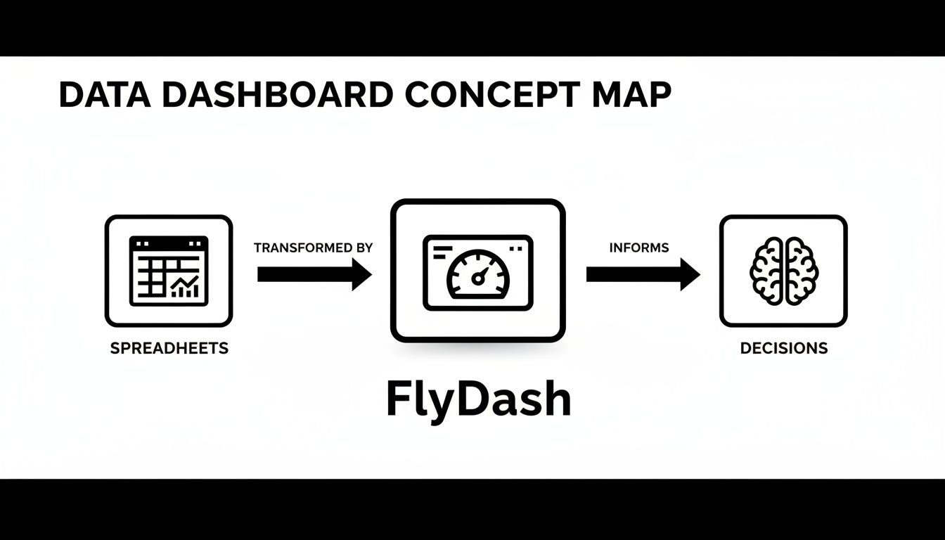
As you can see, tools like FlyDash act as that critical bridge, taking complex spreadsheet data and turning it into intuitive dashboards that lead directly to informed, strategic action.
Operational Dashboards: The Business Cockpit
Operational dashboards are the command centers for your daily grind. They monitor live data and are built for front-line teams who need to react to what’s happening right now. The entire point is to track high-volume, time-sensitive processes to spot and squash problems as they pop up.
Speed is everything here. The data is often updated in real-time or very close to it, giving your teams the immediate visibility they need to stay on top of things.
- Logistics Team: A logistics manager might have an operational dashboard tracking their delivery trucks on a map, monitoring package statuses, and flagging delays. If a truck hits a massive traffic jam, they see it instantly and can reroute.
- E-commerce Store: An online store manager keeps an eye on a dashboard showing live website traffic, abandoned carts, and transaction failures. A sudden spike in failed checkouts could point to a payment gateway issue that needs to be fixed immediately.
- Manufacturing Plant: A factory floor supervisor uses a dashboard to monitor machine uptime and output per hour. If a machine's performance dips, they can get a maintenance crew on it before it causes a major production slowdown.
These dashboards are built for action, not deep thought. They answer one simple question: "What’s happening now, and what do I need to do about it?"
Strategic Dashboards: The Long-Term Telescope
Now, let's zoom out from the immediate to the big picture. Strategic dashboards give you a high-level view of how the business is performing against its long-term goals. These are the tools of the C-suite and senior leadership, acting like a telescope to help them see where the organization is headed over months, quarters, or even years.
Unlike their operational cousins, strategic dashboards are updated less frequently—think daily, weekly, or monthly. They summarize performance across entire departments or the company as a whole.
A strategic dashboard is less about the individual trees and more about the health of the entire forest. It tracks progress toward key business objectives, ensuring the company stays on course.
This sales dashboard template is a perfect example, visualizing top-level KPIs like revenue growth and deal progression over time. It gives a sales leader a quick way to gauge team performance against quarterly targets and spot strategic trends without drowning in the daily noise.
Analytical Dashboards: The Data Microscope
Finally, we have analytical dashboards—the data scientist's microscope. These are built for exploration and discovery, letting users drill deep into historical data, slice it from different angles, and get to the "why" behind the numbers. Business analysts, data scientists, and product managers live in these dashboards.
By design, these tools are highly interactive, loaded with filters, drill-down options, and comparison features. They don't just present data; they invite you to get your hands dirty and investigate it.
The market for these tools is exploding for a reason. The global data visualization market hit an estimated $7,200 million in 2023 and is projected to reach $7,874.5 million by 2026. This growth is driven by the hunger for analytical tools that help businesses make sense of huge datasets, with companies reporting 28% faster decision-making when using them. You can dive deeper into these trends in the full market report from Data Insights.
How to Choose Metrics That Actually Matter
A dashboard is only as good as the numbers it displays. Packing it with dazzling charts that track the wrong things is like having a beautiful car with no engine—it looks impressive but takes you nowhere. The trick is to move past vanity metrics, which feel good but don't actually signal business health, and zero in on actionable KPIs that connect directly to your strategic goals.
Think of it like a fitness tracker. You could track the total number of steps you’ve ever taken in your life. It’s a huge, impressive number (a classic vanity metric). Or, you could track your average heart rate during workouts and how quickly it recovers afterward (actionable KPIs). That second set of numbers tells you if your fitness is actually improving and helps you decide what to do in your next workout.
Your dashboard needs to do the same for your business. It’s there to answer critical questions, not just show off big, feel-good numbers.
Start with Your Business Objectives
Before you even dream of pie charts or bar graphs, you have to answer one simple question: what are we trying to achieve? Every single metric on your dashboard should tie directly back to a specific business objective. If it doesn’t, it’s just noise.
For instance, a marketing team's goal isn't just to "get more traffic." A much better objective is to "increase qualified leads by 15% this quarter." That clarity instantly tells you which numbers matter and which don't.
- Objective: Increase qualified leads by 15%.
- Actionable KPIs: Conversion Rate from traffic to lead, Cost Per Acquisition (CPA), and Lead Quality Score.
- Vanity Metric to Avoid: Total website visitors (a spike in traffic with zero conversions is actually a failure).
This objective-first approach makes sure every element on your dashboard has a purpose. It transforms your dashboard from a digital decoration into a strategic tool.
A dashboard cluttered with vanity metrics is a distraction. A dashboard focused on core business objectives is a command center for growth.
Tailoring KPIs for Different Roles
Different teams have different missions, so their dashboards need to reflect their unique priorities. A one-size-fits-all approach almost never works because what's absolutely critical for a finance lead is merely a point of curiosity for a product manager.
Let's look at how this plays out in the real world. A well-designed dashboard should feel like it was built just for the person using it, giving them the exact information they need to make smart decisions.
The table below breaks down some essential KPIs for a few key roles, showing how their goals drive what they need to measure.
Essential KPIs by Professional Role
| Role | Primary Goal | Key Metrics to Track | Dashboard Type |
|---|---|---|---|
| Operations Manager | Improve process efficiency and reliability. | Order Fulfillment Time, Inventory Turnover, First Contact Resolution (FCR). | Operational |
| Finance Lead | Ensure financial stability and profitable growth. | Cash Flow, Burn Rate, Customer Acquisition Cost (CAC), Lifetime Value (LTV). | Strategic |
| Product Manager | Drive user engagement and product adoption. | Feature Adoption Rate, User Churn Rate, DAU/MAU Ratio, Net Promoter Score (NPS). | Analytical |
| Sales Director | Increase revenue and sales team performance. | Sales Growth, Average Deal Size, Lead-to-Close Ratio, Quota Attainment. | Strategic |
| Marketing Manager | Generate qualified leads and boost brand awareness. | Conversion Rate, Cost Per Lead (CPL), Return on Ad Spend (ROAS), Customer Lifetime Value. | Analytical |
As you can see, the "right" KPIs are completely dependent on the job to be done. The finance lead worries about burn rate, while the product manager is obsessed with feature adoption. Tying metrics to roles is the secret to building dashboards that people actually use.
The value of this approach is being recognized across the board. By 2024, the data visualization market had swelled to $4.8 billion and is on a path to hit $12.3 billion by 2033. Organizations that get this right see insights 5x faster, with finance and healthcare leading the way. In fact, a striking 78% of firms report better decision-making thanks to visualization tools. You can get a deeper look at these market trends in the full report from Market Trends Analysis.
Designing Dashboards People Actually Use
A great dashboard does more than just throw numbers on a screen; it tells a clear, compelling story. Think of it as the difference between a cluttered, messy desk and a perfectly organized workspace. On one, you can't find anything. On the other, everything you need is right at your fingertips, exactly where you expect it to be.
Good design is what bridges the gap between raw, complex data and genuine human understanding. It’s not about making things look pretty—it's about making them make sense, instantly. The goal is to create a visual path that guides the user's eye, leading them from the big picture down to the important details without any friction.

Choosing the Right Visual for Your Data
One of the quickest ways to create a confusing dashboard is by picking the wrong chart for the job. Every type of visualization has a specific purpose, and a mismatch can easily lead someone to the wrong conclusion. The story you're trying to tell with your data should always dictate your choice of chart.
Here are a few time-tested rules of thumb:
- Comparing values across different groups? Use a bar chart. Nothing beats it for straightforward comparisons, like seeing which product line is bringing in the most revenue.
- Showing a trend over time? A line chart is your best friend. It’s perfect for tracking continuous data, like website traffic over the last 30 days or quarterly sales figures.
- Displaying parts of a whole? Be careful with pie or donut charts. They only really work when you have just a few categories (ideally under five) that clearly add up to 100%. Any more than that, and they become impossible to read.
- Looking for a relationship between two numbers? A scatter plot is what you need. It’s the best way to spot correlations, like whether an increase in ad spend corresponds to a rise in sales.
Getting this part right is fundamental. It ensures your data is represented honestly and intuitively, making the whole dashboard far more effective.
The Power of Layout and Whitespace
How you arrange the elements on the screen is just as critical as the charts themselves. A well-thought-out layout creates a natural flow, almost like reading a page in a book. This is why you should always put the most important, high-level information in the top-left corner—it’s where our eyes naturally start.
A well-organized dashboard follows the "inverted pyramid" principle from journalism. Start with the most important, high-level summary at the top, and allow users to progressively drill down into more granular details as they move down the page.
And don't underestimate the power of whitespace. It's not just empty area; it's an active design tool that helps reduce mental clutter. A crowded dashboard is overwhelming. One with plenty of breathing room feels calm, clear, and much easier to digest.
Using Color and Simplicity to Your Advantage
Color should be a tool, not a decoration. A simple, consistent color palette can do heavy lifting: it can highlight key data points, show status at a glance (think green for good, red for bad), or group related metrics together. The key is to resist the urge to use a rainbow of bright, competing colors that just create visual noise.
This ties into the idea of the data-ink ratio—a concept that argues most of the "ink" on a chart should be dedicated to the data itself. To put that into practice, start removing anything that doesn't add real value:
- Get rid of distracting gridlines.
- Avoid 3D effects, shadows, and heavy borders.
- Stick to clean, simple fonts.
The field of dashboard design is always evolving, too. AI and ML are no longer buzzwords; they're becoming standard for predictive analytics that can forecast market trends. In fact, business intelligence adoption has jumped 65% since 2020, mostly because modern self-service tools and mobile-first designs are finally letting non-technical folks explore data on their own. You can dive deeper into these trends at DataInsightsMarket.com.
At the end of the day, by focusing on simplicity and the user, you can build dashboards that people don't just have to use, but actually want to use.
Build Your First Dashboard in Minutes
All the theory in the world is great, but putting it into practice is what really counts. So, let’s shift gears from understanding dashboards to actually building one. Not long ago, this was a massive undertaking—a project demanding long development cycles, complicated code, and a whole team of engineers.
Thankfully, that’s just not the reality anymore.
Modern platforms have completely rewritten the rules. Now, anyone from an operations manager to a startup founder can build a powerful, fully functional dashboard in minutes. The secret is moving away from manual coding and embracing intuitive, AI-powered tools.
This new way of working flips the old development process on its head. Instead of getting stuck writing code for weeks, you can generate a complete application stack almost instantly. That frees you up to focus on what actually matters: connecting your data and making sure the final dashboard tells a clear story.
From Prompt to Production in Four Simple Steps
Building a dashboard with a platform like FlyDash is designed to be ridiculously straightforward. The whole workflow is centered on speed and simplicity, knocking down the technical barriers that used to get in the way.
You don't need to know a single line of code to get started. It’s a total break from the old days when a simple chart adjustment could take a developer days to implement.
Here’s how easy it is to get your first dashboard up and running:
- Describe What You Want in Plain English: Just type out your idea. Seriously. You could write something like, "Create a sales dashboard to track monthly recurring revenue, new sign-ups, and customer churn rate."
- Securely Connect Your Data: After the AI generates the dashboard’s framework, you just need to link your data sources. This can be anything from a SQL database or a REST API to a simple Google Sheet.
- Collaborate and Tweak in Real-Time: This is where it gets fun. You and your team can jump in and work on the dashboard at the same time—dragging and dropping charts, resizing components, and adjusting layouts, kind of like editing a Google Doc.
- Deploy with a Single Click: Once you’re happy with how it looks and works, you can deploy it instantly. It's live and ready to be shared with stakeholders to start driving decisions.
Here's a look at the very first step in FlyDash's AI App Generator, where you just describe what you need.
This image shows how a simple text prompt for a complex, multi-part dashboard gets turned into a real application structure, all set for you to connect your data and start customizing.
Why This New Way Works So Well
This approach is a game-changer because it cuts out the most tedious, time-consuming parts of traditional development. You get to skip all the boilerplate code and backend setup and jump straight to the good stuff: analyzing data and crafting meaningful visualizations. The AI does the heavy lifting in the background, generating all the necessary code automatically.
The goal is to move at the speed of thought. If you can describe what you need, you should be able to build it. This accessibility empowers teams to be more self-sufficient and data-driven.
This workflow doesn't just speed things up; it makes the whole process more collaborative. When product managers, finance leads, and operations teams can build or at least tweak their own tools, they aren't stuck waiting on an overloaded engineering team.
This creates a powerful feedback loop. The people who actually use the dashboard are the same ones refining it, which guarantees the final tool is perfectly matched to their needs. The takeaway is clear: anyone can now build powerful, custom data visualization dashboards in a matter of minutes, not weeks.
Common Dashboard Mistakes and How to Avoid Them

It’s a tale as old as time: a team spends weeks building a dashboard, only for it to gather digital dust. Even with the best intentions, dashboard projects can easily go off the rails, becoming beautiful but ultimately useless artifacts.
The good news is that most of these failures are entirely preventable. Building truly effective data visualization dashboards is less about technical wizardry and more about sidestepping the common traps that sink so many projects. By learning to recognize these pitfalls, you can build tools that people actually want to use.
Mistake 1: Overcomplicating the Design
This is the classic blunder. In an effort to be comprehensive, we cram every possible chart, metric, and color onto a single screen. Instead of clarity, the user gets chaos. A wall of data doesn't provide insight; it triggers immediate fatigue.
Imagine trying to follow ten different conversations at once—you can't make sense of any of them. A cluttered dashboard forces the brain to work overtime just to figure out where to look, completely defeating the purpose of at-a-glance information.
Solution: Embrace simplicity and ruthless focus.
- One Idea, One Visual: Every single chart should answer one specific question. If you have more questions, add more charts—don't try to make one visual do the work of five.
- Let It Breathe: Whitespace is your best friend. It gives your data room to breathe and guides the user’s eye, creating a sense of order and calm instead of anxiety.
- Create a Clear Path: Your most important, big-picture KPIs should live at the top left. This creates a natural starting point for the eye and lets users drill down into the details in a logical flow.
Mistake 2: Choosing Irrelevant Metrics
A dashboard can be stunningly designed but completely worthless if it tracks the wrong things. This happens when we fall in love with "vanity metrics"—numbers that look impressive on the surface but have no real connection to business goals. Tracking total website visits, for example, is far less meaningful than tracking the conversion rate of those visitors.
When the metrics don't help people make better decisions, the dashboard becomes a distraction, not a strategic tool. It has failed its one true job.
Your dashboard should be a strategic tool, not a trophy case for big numbers. Every metric must justify its existence by tying directly to a core business objective.
Solution: Talk to the end-users from the very beginning.
Before a single line of code is written or a chart is designed, sit down with the people who will actually rely on this dashboard. Ask them what decisions they struggle with and what information would make their jobs easier. This simple conversation is the secret to building a tool that solves real problems.
When you align every metric with a user's actual needs, you create a dashboard they can’t imagine living without. It’s the single most effective way to guarantee adoption and create lasting value.
Frequently Asked Questions
As you get your hands dirty with data visualization dashboards, a few common questions always seem to surface. Let's tackle them head-on to clear up any confusion before you start building.
Report vs. Dashboard: What's the Difference?
This one comes up all the time, and for good reason. The line can seem blurry, but the difference is fundamental.
Think of a report as a static photograph. It’s a snapshot of your data from a specific point in time, usually delivered as a PDF or spreadsheet. It’s perfect for deep, historical analysis, like a quarterly earnings breakdown. It tells you what happened.
A dashboard, in contrast, is more like a live video feed. It’s dynamic, interactive, and designed to show you what’s happening right now. While a report is for reflection, a dashboard is for action.
How Often Should I Update My Dashboard?
There's no magic number here. The right update frequency comes down to one thing: the speed at which you need to make decisions. Your dashboard's refresh rate should mirror the pace of the work it supports.
- Operational Dashboards: These often demand real-time or near-real-time data. A supply chain manager tracking live shipments needs updates by the minute, not by the day.
- Analytical Dashboards: Daily or weekly updates are typically the sweet spot. An analyst exploring sales trends needs fresh data, but they’re looking for patterns over time, not moment-to-moment fluctuations.
- Strategic Dashboards: For the big-picture view, weekly or monthly updates are usually plenty. Executives monitoring long-term goals don’t need to see the data change with every tick of the clock.
Can I Build a Dashboard Without Knowing How to Code?
Yes, you absolutely can. This is probably one of the biggest and most exciting changes in the data world over the last few years. Not long ago, creating a custom dashboard meant you needed a developer and a lot of technical know-how.
Today, that barrier is gone. Modern no-code and AI-powered platforms have put dashboard creation directly into the hands of the people who use them. The conversation has shifted from coding to strategy, empowering business users to build their own tools without writing a single line of code.
This means your ability to turn data into clear, actionable insights is no longer limited by your technical skills.
Ready to build a powerful dashboard in minutes, not months? With FlyDash, you can describe what you need in plain English and let AI generate a complete, working application. Skip the code and start making data-driven decisions today. Build your first dashboard for free at https://flydash.io
Ready to Build Your App?
Turn your idea into a production-ready React Native app in minutes.
Free tools to get you started
Free AI PRD Generator
Generate a professional product requirements document in seconds. Describe your product idea and get a complete, structured PRD instantly.
Try it freeFree AI App Name Generator
Generate unique, brandable app name ideas with AI. Get creative name suggestions with taglines, brand colors, and monogram previews.
Try it freeFree AI App Icon Generator
Generate beautiful, professional app icons with AI. Describe your app and get multiple icon variations in different styles, ready for App Store and Google Play.
Try it freeFrequently Asked Questions
RapidNative is an AI-powered mobile app builder. Describe the app you want in plain English and RapidNative generates real, production-ready React Native screens you can preview, edit, and publish to the App Store or Google Play.